Part 3: Creating custom report and figures
by Morgane Desmau & Marco Alsina
Last update: June 2021
This notebook explains the following steps:
Generating a custom report.
Generatiing a custom figure.
Saving a figure.
Important: This tutorial assumes you have succesfully completed the previous tutorials in the series:
[1]:
# checking version of araucaria and dependencies
from araucaria.utils import get_version
print(get_version(dependencies=True))
Python version      : 3.9.4
Numpy version       : 1.20.3
Scipy version       : 1.6.3
Lmfit version       : 1.0.2
H5py version        : 3.2.1
Matplotlib version  : 3.4.2
Araucaria version   : 0.1.9
1. Retrieving and summarizing the database
In this case we will be reading and processing a minerals database measured at the Fe K-edge in the P65 beamline of DESY, Hamburg (data kindly provided by Morgane Desmau):
Fe_database.h5
We will use the get_testpath() function to retrieve the filepath to the database and summarize its contents.
Note
If you prefer to process your own database, just modify the filepath to point to the location of your file.
[2]:
# retrieving filepath
from pathlib import Path
from araucaria.testdata import get_testpath
from araucaria.io import summary_hdf5

fpath = get_testpath('Fe_database.h5')

# summarizing database
report = summary_hdf5(fpath)
report.show()
=================================
id  dataset           mode    n
=================================
1   FeIISO4_20K       mu      5
2   Fe_Foil           mu_ref  5
3   Ferrihydrite_20K  mu      5
4   Goethite_20K      mu      5
=================================
2. Generating a custom report
Here we will be analyzing the specrtra of Ferrihydrite and Goethite, and store the results in a custom Report.
We will first declare the required dictionaries to perform spectral normalization and background removal. This allows access and later modification of the parameters if needed, without changing our code for report generation and plotting.
Note that we also declare a function maxindex() to compute the index for the maximum value in an array. We will be using this function to compute the maximum values on dXANES, XANES and \(|\chi(R)|\) spectra.
[3]:
import numpy as np
from scipy.signal import argrelextrema

# name of groups
groupnames = ('Goethite_20K', 'Ferrihydrite_20K')

# parameters for normalization, background removal, and foward fourrier transform
kw     = 2
win    = 'kaiser'

pre_edge_kws = {'pre_range' : [-160, -40],
                'post_range': [140, 950],
                'nvict'     : 2,
                'nnorm'     : 2,}

autobk_kws   = {'k_range'   : [0, 15],
                'kweight'   : kw,
                'rbkg'      : 1,
                'win'       : win,
                'dk'        : 0.1,
                'clamp_hi'  : 35,}

ftf_kws      = {'k_range'   : [2, 12],
                'kweight'   : kw,
                'win'       : win,}

def maxindex(data):
    '''Index of maximum value in an array
    '''
    index = argrelextrema(data, np.greater, order=100)[0]
    return index[0]
We now read and process the spectra, while storing the computed records in a Report. Several steps are performed in a nested loop:
The read_hdf5() function reads a Group from a HDF5 database.
The find_e0() function computes the absorpton threshold (\(E_0\)).
The pre_edge() function normalizes the spectrum.
The autobk() function performs background removal to obtain an EXAFS spectrum.
The xftf() function performs a fast forward Fourier transform of the EXAFS spectrum.
The maximum values for the selected spectra are computed.
The values are added to a Report.
The group is stored in a Collection.
Finally we print a summary of the custom Report.
[4]:
from araucaria import Report, Collection
from araucaria.io import read_hdf5
from araucaria.xas import find_e0, pre_edge, autobk, xftf

# initializing the report
report = Report()
col_names = ['Sample name', 'e0[eV]', 'Edmax[eV]','Emax[eV]', 'Rmax[A]']
report.set_columns(col_names)

# initializing a collection
collection = Collection()

for i, name in enumerate(groupnames):
    # reading and processing spectra
    data = read_hdf5(fpath, name=name)
    e0   = find_e0(data, method='halfedge', pre_edge_kws = pre_edge_kws, update = True)
    pre_edge(data, e0 = e0, update=True, **pre_edge_kws)
    autobk(data, update = True, **autobk_kws)
    xftf(data, update = True, **ftf_kws)

    # extracting maximum for dmu, mu, and chi(R)
    deriv_max_index = data.energy[maxindex(np.gradient(data.mu)/np.gradient(data.energy))]
    mu_max_index    = data.energy[maxindex(data.mu)]
    r_max_index     = data.r[maxindex(data.chir_mag)]

    # adding content to the report
    report.add_row([groupnames[i], e0, deriv_max_index, mu_max_index, r_max_index])

    # add group to collection
    collection.add_group(data)

report.show()
========================================================
Sample name       e0[eV]  Edmax[eV]  Emax[eV]  Rmax[A]
========================================================
Goethite_20K      7125.2  7127.3     7131      1.4726
Ferrihydrite_20K  7124.8  7127.4     7132.6    1.4726
========================================================
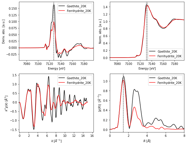
3. Data visualization
We can now plot the data stored in the Collection along with the computed values.
We use the fig_xas_template() function to create a Figure and axes objects with the following attributes:
2 by 2 pre-defined panels for dXANES, XANES, EXAFS, and FT-EXAFS spectra.
A dictionary to specify figure decorators (fig_pars). Note that we can also specifiy a
prop_cycledictionary to preset the color of the plots.A dictionary to specify general parameters for the figure (fig_kws). These arguments are passed directly to the
matplotlibconstructor.
Finally, we access the specific columns of the Report through the get_cols() method. Since data is stored as text, we request conversion with the astype=float argument.
[5]:
import matplotlib.pyplot as plt
from araucaria.plot import fig_xas_template

# figure parameters
k_edge   = 7112
fig_kws  = {'figsize'   : (9, 7)}  # figure size in inches
fig_pars = {'e_range'  : (k_edge-45, k_edge+85),
           'k_range'   : [-0.1, 16.3],
           'k_weight'  : kw,
           'k_ticks'   : np.linspace(0,16,9),
           'r_range'   : [0, 8],
           'r_ticks'   : np.linspace(0,8,5),
           'prop_cycle': [{'color'     : ['black', 'red'],
                           'linewidth' : [1.5    , 1.5  ],}]
           }

# initializing figure and axes
fig, axes = fig_xas_template(panels = 'dx/er', fig_pars = fig_pars, **fig_kws)

# extracting values from the report
dmu_max = report.get_cols(names=['Edmax[eV]'], astype=float)
mu_max  = report.get_cols(names=['Emax[eV]'], astype=float)
r_max   = report.get_cols(names=['Rmax[A]'], astype=float)

# plotting data
for i, name in enumerate(groupnames):
    data = collection.get_group(name)

    # plotting spectra
    axes[0,0].plot(data.energy, np.gradient(data.mu)/np.gradient(data.energy), label = name)
    axes[0,1].plot(data.energy, data.flat, label = name)
    axes[1,0].plot(data.k, data.k**kw * data.chi, label = name)
    axes[1,1].plot(data.r, data.chir_mag, label = name)

    # plotting auxiliary lines
    axes[0,0].axvline(float(dmu_max[i]),0,1, dashes=[3,1], color = 'gray')
    axes[0,1].axvline(float(mu_max[i]) ,0,1, dashes=[3,1], color = 'gray')
    axes[1,1].axvline(float(r_max[i])  ,0,1, dashes=[3,1], color = 'gray')

for ax in np.ravel(axes):
    ax.legend()

fig.tight_layout()
plt.show()
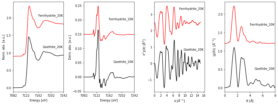
The fig_xas_template() function is quite flexible to generate figure templates. Here we show the creation of panels in a single file to plot and annotate offset spectra.
[6]:
# figure parameters
steps    = [0.9, 0.15, 2.5, 1.2]
align    = 'right'
fsize    = 10
fig_kws  = {'figsize'   : (13, 5)}
fig_pars = {'e_range'   : (k_edge-30, k_edge+130),
            'e_ticks'   : [k_edge-30, k_edge+10, k_edge+50, k_edge+90, k_edge+130],
            'k_range'   : [-0.1,16.3],
            'k_weight'  : kw,
            'k_ticks'   : np.linspace(0,16,9),
            'r_range'   : [0, 8],
            'r_ticks'   : np.linspace(0,8,5),
            'prop_cycle': [{'color'     : ['black', 'red'],
                            'linewidth' : [1.5    , 1.5  ],}]
           }

# initializing figure and axes
fig, axes = fig_xas_template(panels = 'xder', fig_pars = fig_pars, **fig_kws)

# plotting data
for i, name in enumerate(groupnames):
    data = collection.get_group(name)

    # plotting spectra
    axes[0].plot(data.energy, i*steps[0] + data.norm)
    axes[1].plot(data.energy, i*steps[1] + np.gradient(data.mu)/np.gradient(data.energy),
                 label = name)
    axes[2].plot(data.k, i*steps[2] + data.k**2 * data.chi, label = name)
    axes[3].plot(data.r, i*steps[3] + data.chir_mag, label = name)

    # annotating spectra
    axes[0].text(7240, 1.15 + i*steps[0], s = name, ha=align, fontsize=fsize)
    axes[1].text(7240, 0.05 + i*steps[1], s = name, ha=align, fontsize=fsize)
    axes[2].text(16  , 0.8  + i*steps[2], s = name, ha=align, fontsize=fsize)
    axes[3].text(7.9 , 0.5  + i*steps[3], s = name, ha=align, fontsize=fsize)

fig.tight_layout()
fig.subplots_adjust(wspace=0.4)
plt.show()
4. Saving a figure
Figures in araucaria are produced with the matplotlib library. Thus, we can save the resulting Figure object with the savefig method.
[7]:
figpath = 'figure.pdf'
fig.savefig(figpath, bbox_inches='tight', dpi=300)
print ('Figure saved in %s' % figpath)
Figure saved in figure.pdf